
Colour perception is deeply personal and has a tangible effect on how we feel both mentally and physically. So colour choices for your home should always be about what you love, the mood you aim to create and the purpose of the space. That said, colour trends are interesting to watch and undoubtedly influence our choices be it on a conscious or sub-conscious level.

Every December the colour experts at Pantone Color Institute announce their colour of the year. The selection process involves trend analysis and combing the world looking for new colour influences, including fashion, entertainment, art, design, world events, social media and socio-economic conditions. Pantone’s colour of 2019 is Living Coral also known as Pantone 16-1546, a warm and vibrant peachy orange. In the home I’m sure we’ll see more of this colour in accents and accessories but my pick is that any colour of great volume in our Kiwi homes will be a little more subtle, colours that whisper rather than shout.
Read on to see my top picks on what colours we’ll see more of in the home this year.
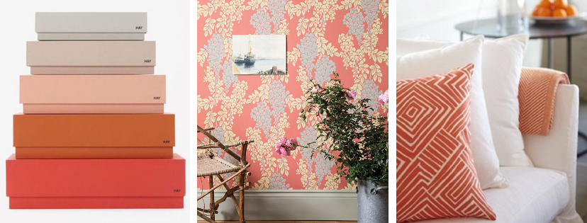
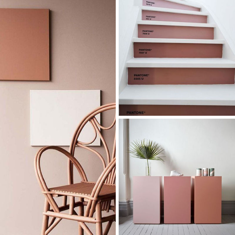
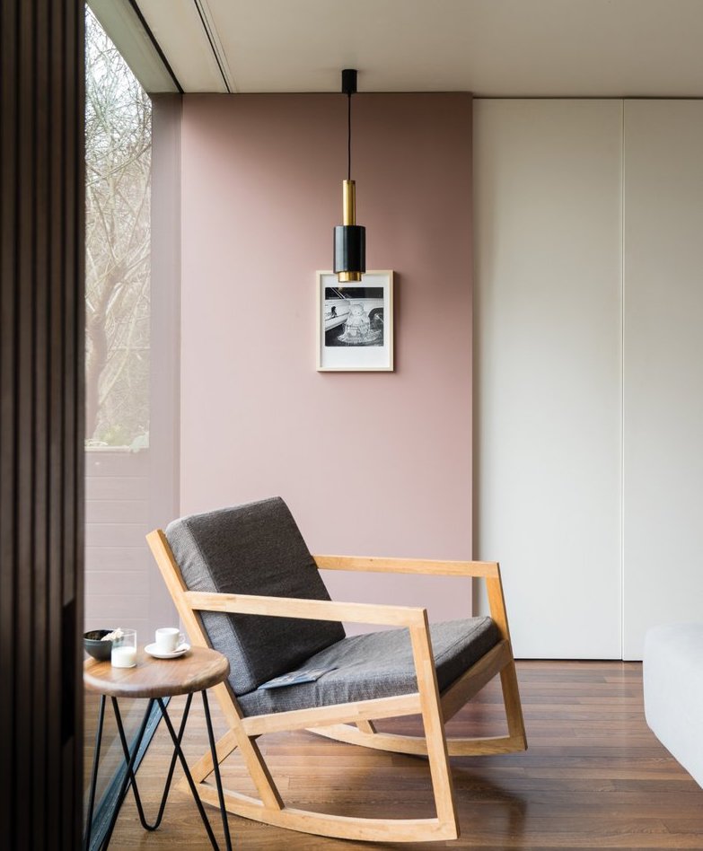
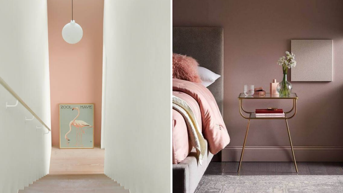
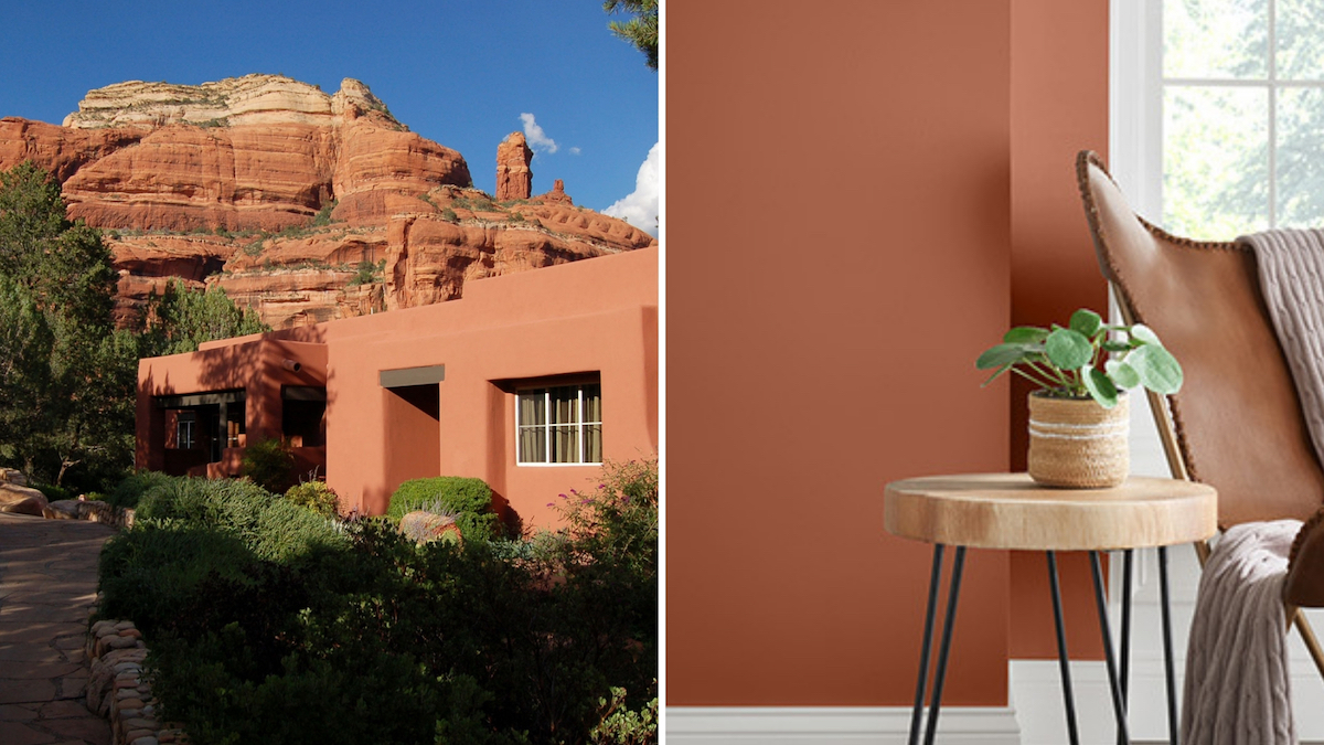
SPICY REDS, ROSE & TERRACOTTA
Shades of earthy and weathered reds and pinks are coming to the fore – easy on the eye and stirring to the soul. They create modern rustic spaces with colours that make us feel like we are being given a great big hug. There’s an option appropriate for any room in your home where you’d like to create a warm and inviting space and these hues are often used as part of a tonal colour scheme with interesting combinations selected within the same colour family.
SOURCE | Rockett St George, Pantone, Pinterest
SOURCE | Farrow & Ball
SOURCE | Jotun, Pinterest
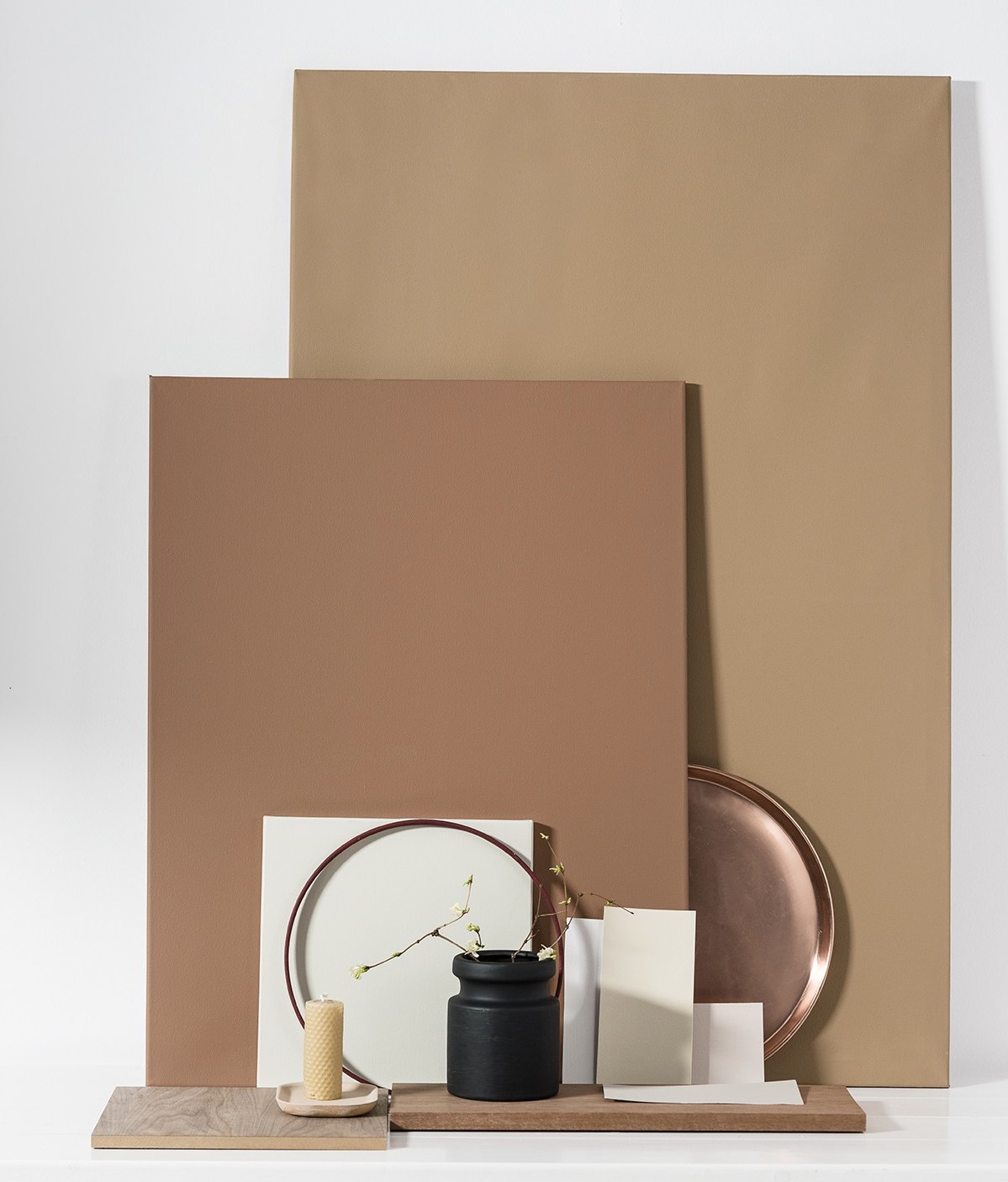
We’ll continue our rediscovery of pink with shades of romantic rose and muted blush – perfect grown-up pinks with an earthy undertone. Peachy tones mix with millennial pink to create softer soothing versions of Pantone’s Living Coral.
American paint firm Sherwin-Williams named ‘Cavern Clay’ their colour of the year (below), a warm nature-inspired hue of canyon-cool terracotta. Straddling the tonal boundaries between a rusty brown and a brick orange, Cavern Clay is a contemporary take on 90’s terracotta and looks especially good surrounded by natural materials like wood, stone, jute and rattan.
SOURCE | Sherwin-Williams
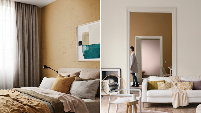
EARTHY CARAMEL
Dulux UK named their colour of 2019 as Spiced Honey, a beautiful shade filled with warm and inviting tones of amber and rich caramel. Spiced Honey is billed as a comforting colour, a soothing retreat from the troubled times we’ve been living through in 2018. The colour is designed to generate a warm, relaxed, atmosphere and depending on the palette and light surrounding it, it can be both calming and nourishing or stimulating and energising. It looks especially good when teamed with whites and off whites, earthy shades of red and pink and plenty of natural textures in furniture and furnishings which gives it a contemporary feel.
SOURCE | Dulux
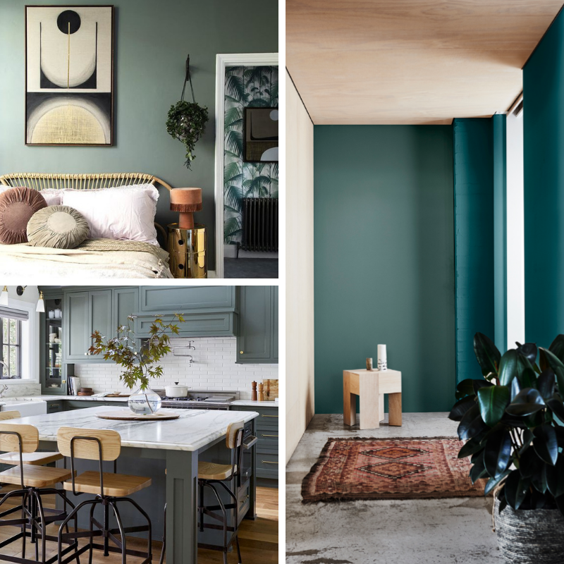
BLUEY-GREENS AND GREENY BLUES
Greenery was Pantone’s colour of the year 2017 and continues to be an enormously popular colour in all it’s shades. In 2019 we’re set to see more use of dark sophisticated greens with undertones of grey and blue – a modern twist on forest greens.
SOURCE | Pinterest, Emily Henderson,Dulux
Dark walls are a great way to bring drama to a space and blues and greens are the go to. Blues will become more green and greens will become more blue – beautiful moody shades that keep you guessing with changing light and time of day. Deep greens and blues feel protective so are great to use in rooms that we spend time in at night and make an excellent backdrop to feature lighting.
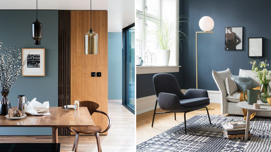
SOURCE | Farrow & Ball
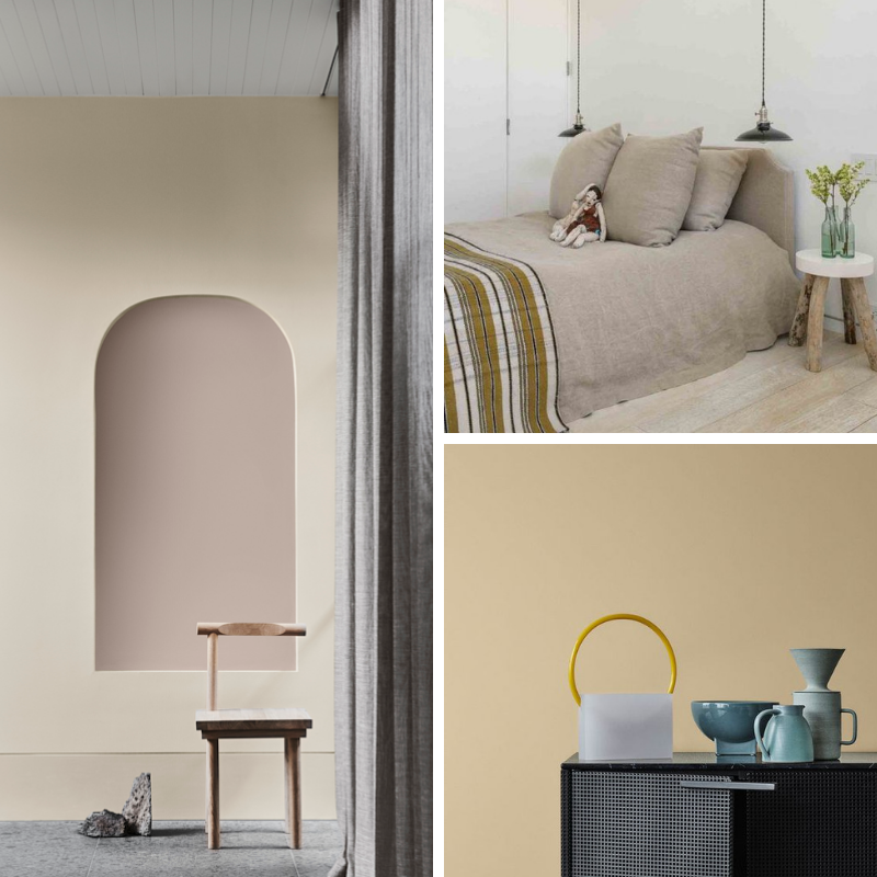
THE NEW NEUTRALS
White walls have some serious competition in 2019 with the arrival of a new approach to neutral palettes. As colour confidence has grown over the last few years, the demand for pale tones and blush pink has evolved to create a whole new range of neutrals, from calming greens and blues, soft lilac to greys with a huge variety of undertones.
SOURCE | Dulux, Benjamin Moore, Dulux
There is however, nothing more classic than an all white palette and while pure white is a go-to for many homemakers, 2019 will see shades that are more sandy. Creamier shades with bolder undertones creating more depth and movement with changing light over the day.
SOURCE | Dulux
SOURCE | Dulux, Pinterest, Jotun
When it comes to choosing colour it can be overwhelming defining what you would like to achieve and selecting from a huge range of options. A coat of paint however is the quickest and easiest way to modernise the look and change the feeling of a space. If you would like help choosing colours for your home, please get in touch here.